Interview with Carol Wates
Carol, considering your preference for creating art "en plein air" using the Brushes App on your iPad, how do you think the immediacy and mobility of digital tools alter the traditional painter's engagement with natural environments? Could you elaborate on the advantages and challenges of capturing nature’s fleeting moments digitally as opposed to traditional mediums?
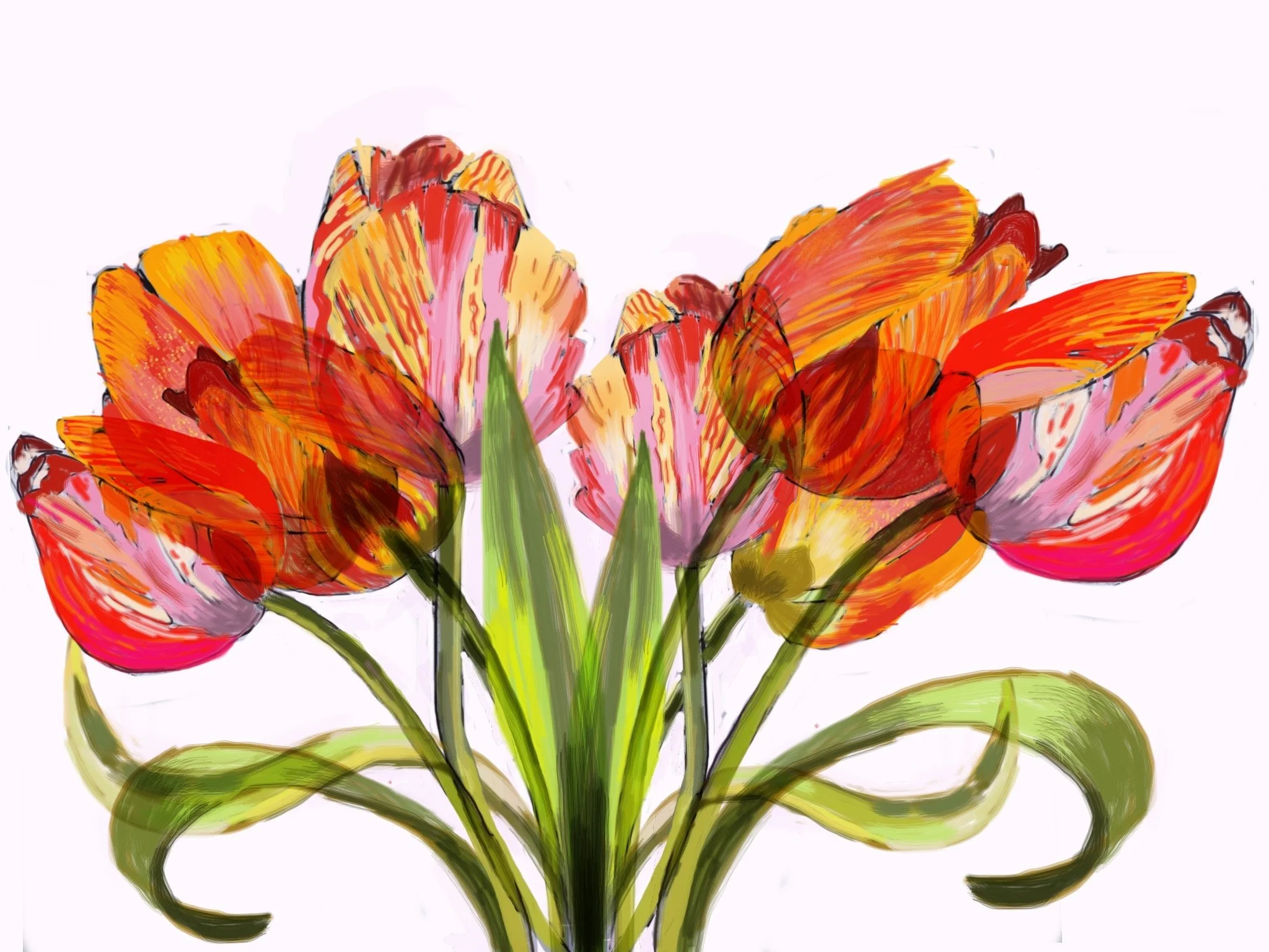
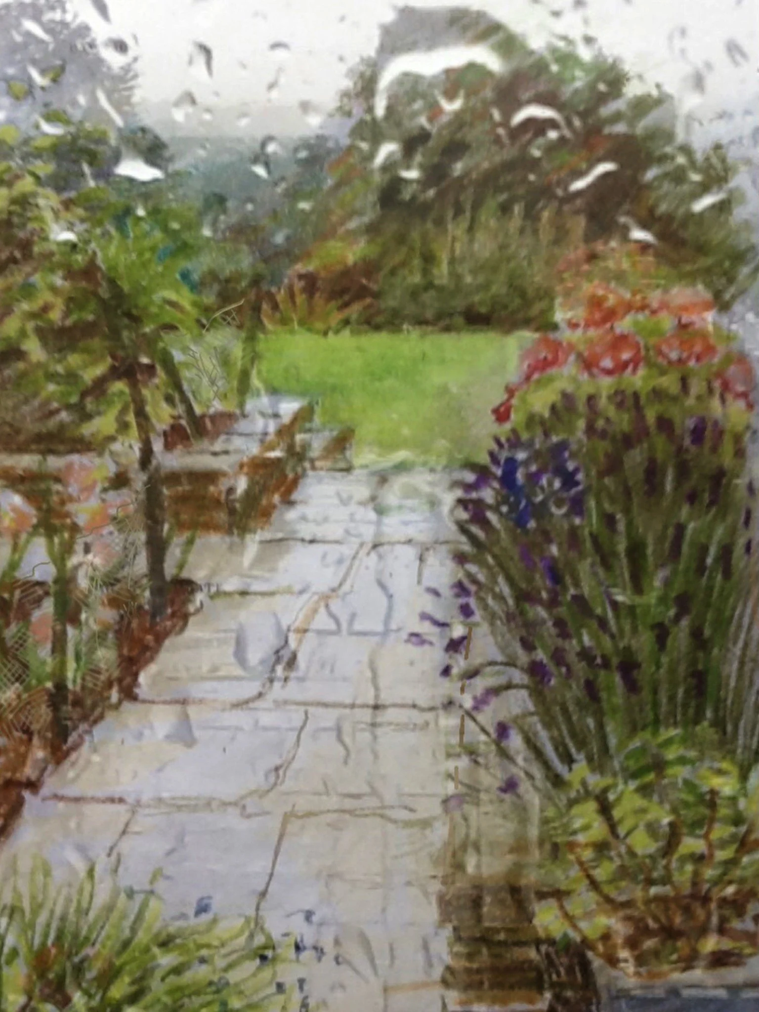
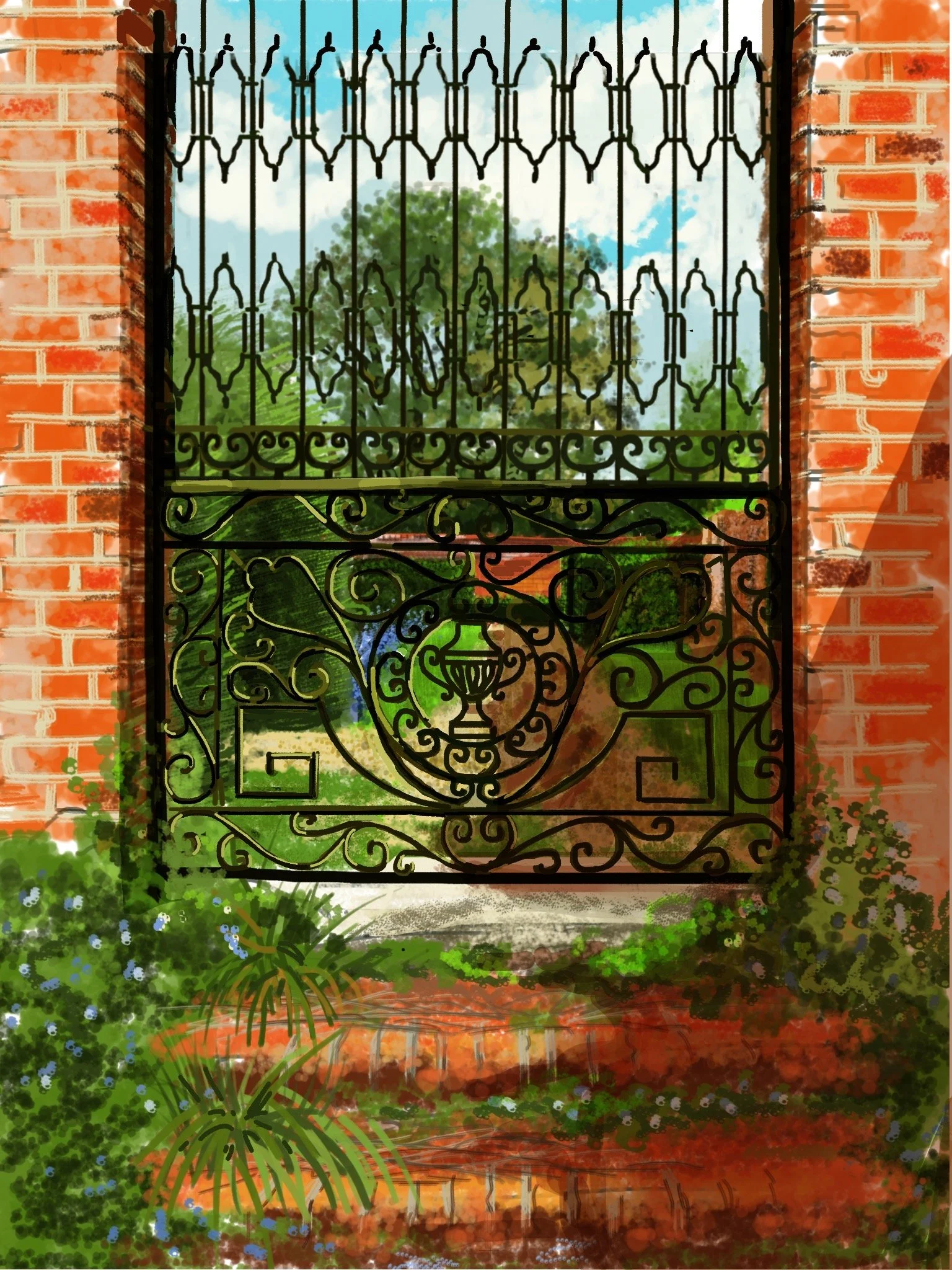
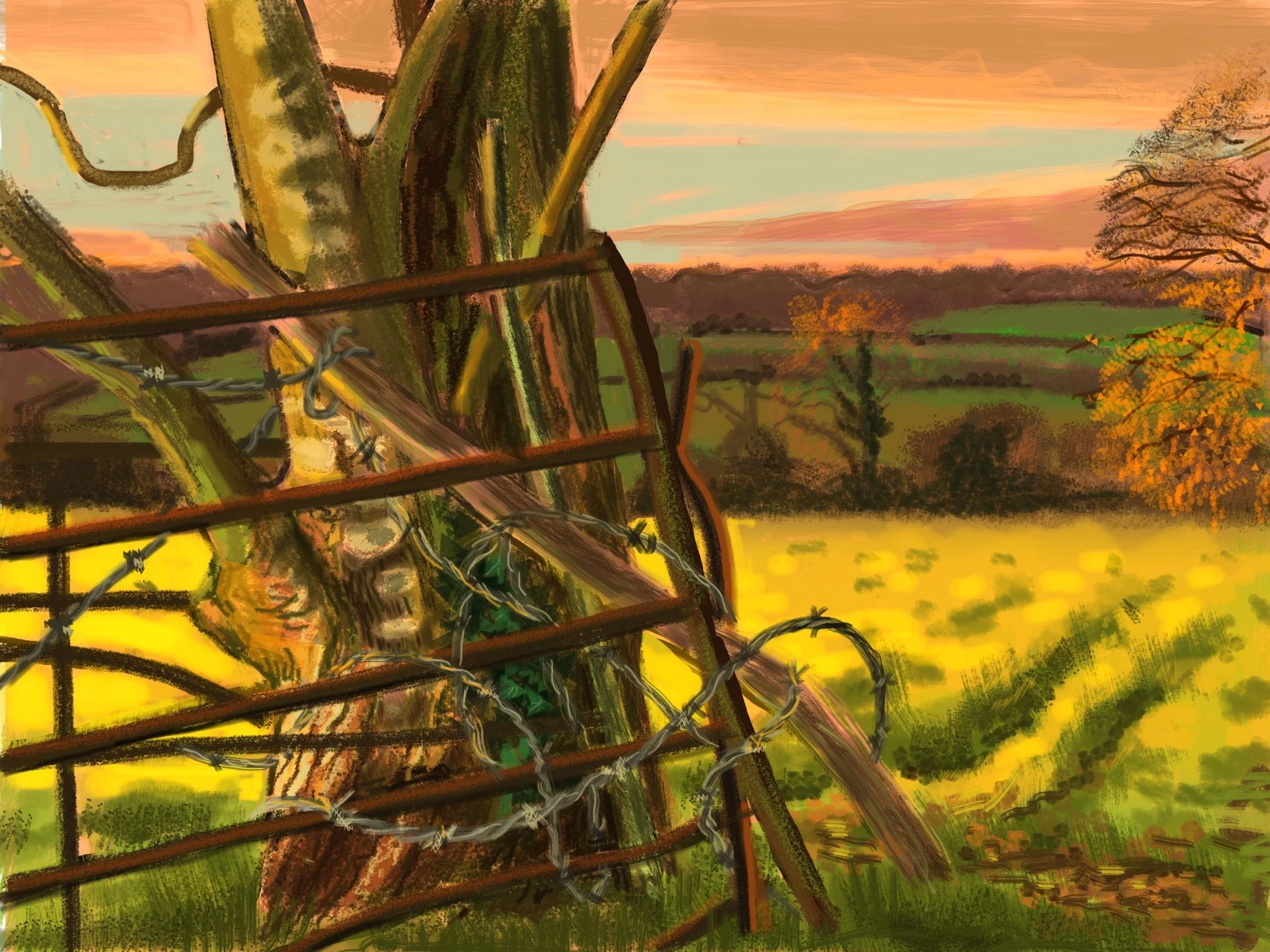
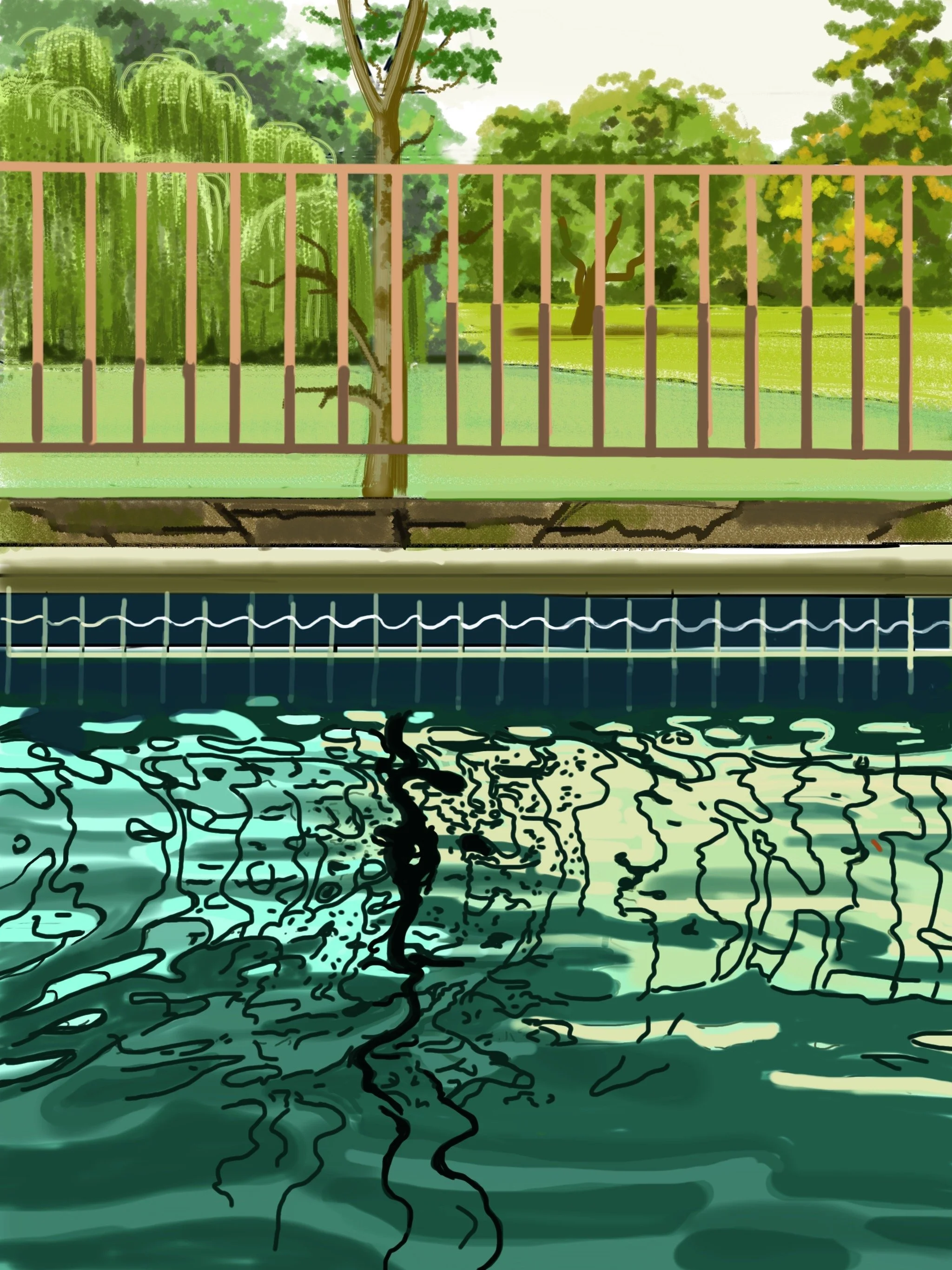
I think immediacy is the key word to everything I know on the iPad. I suppose generally in an indoor or confined space, things don’t move much, but ‘En Plein Air’ things move the whole time. Colour and light changes with the seasons. Rain, wind, sunlight and temperature changes with the season. So, the immediacy and mobility of digital tools, I can change and capture what is infant of me very quickly. With traditional tools, i.e. oil paints, you don’t have that versatility. As they say, ‘you have to wait for the paint to dry’. David Hockney said ‘on the iPad, I can catch the light very quickly, I think it’s the fastest medium I’ve ever found, much faster than watercolour’.
Your work is heavily influenced by David Hockney’s iPad creations. In what ways do you believe your approach and thematic focus diverge from his, particularly in the ways you each handle aspects like light and color in digital landscapes?
I am an ardent admirer of David Hockney work. He embraces so many disciplines, drawing, painting, photography and theatre design, to name a few. I think this is a sign of the creative genius. Why not admire his iPad pictures for that reason? He trained mainly as a painter, so his mark making is very important to him. On the other hand, I trained mainly as an illustrator, and later as a visualiser. I worked a lot with design and typography, so I like to think that my iPad pictures embrace all these things.
The limitation of prints to just ten copies per artwork suggests a unique stance on art scarcity and digital reproduction. Could you discuss the philosophy behind this choice and how it impacts the perception and value of digital art in the contemporary market?
I have quite a few iPad pictures stored with Verisart as NFT’s (non-fungible tokens). In effect, they are guaranteed certificates of digital ownership, stored on the block chain. A piece of digital art is easily replicable, but NFT’s allow for its ownership to be exclusive and verified. I have sold pictures this way, so waiting to see if this is a way forward.
Many artists have embraced technology, but you’ve chosen the Brushes App as your primary medium. What specific features or attributes of this app enhance your ability to translate the complexities of nature into digital art? How do you balance technological convenience with artistic authenticity?
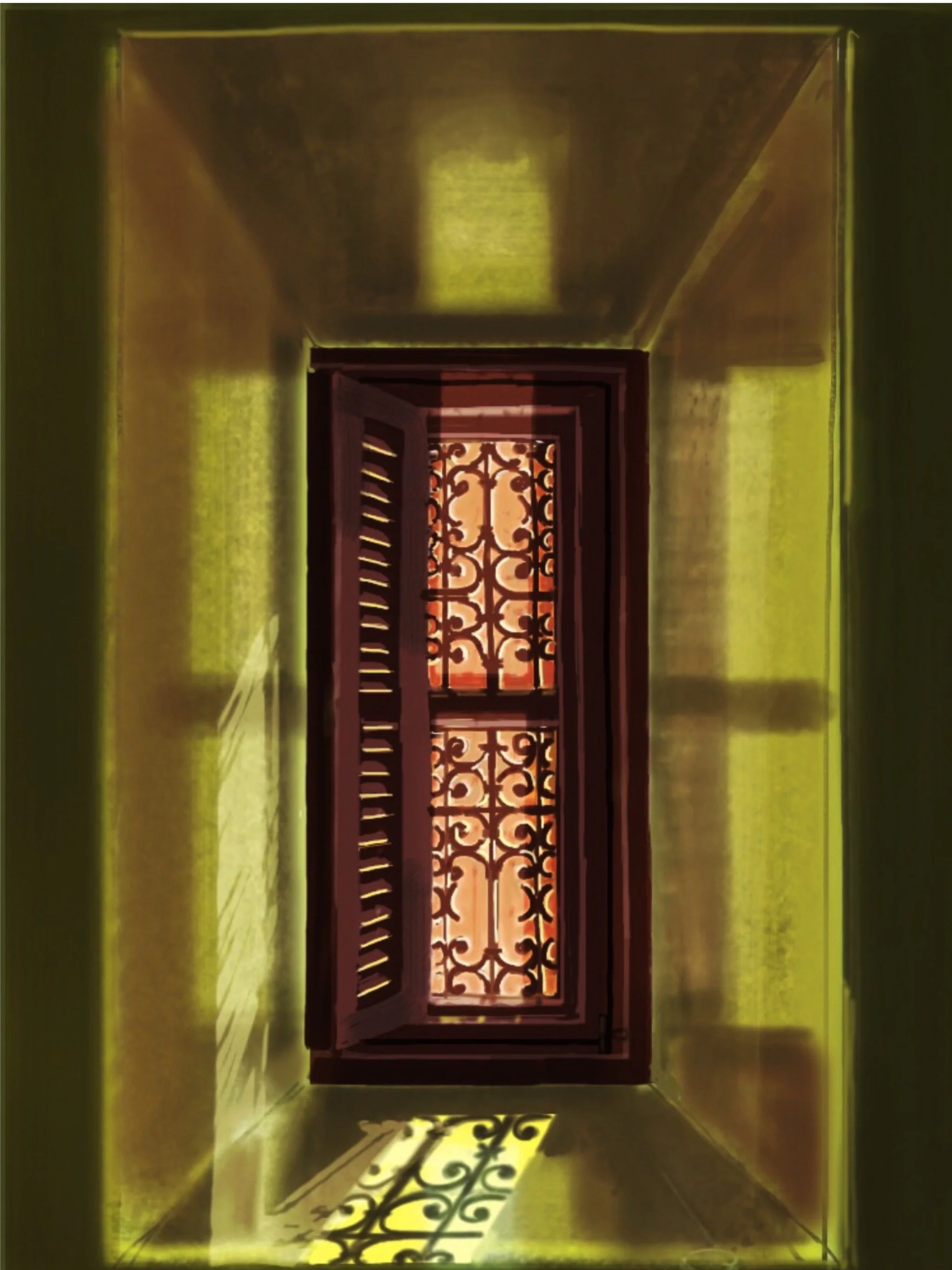
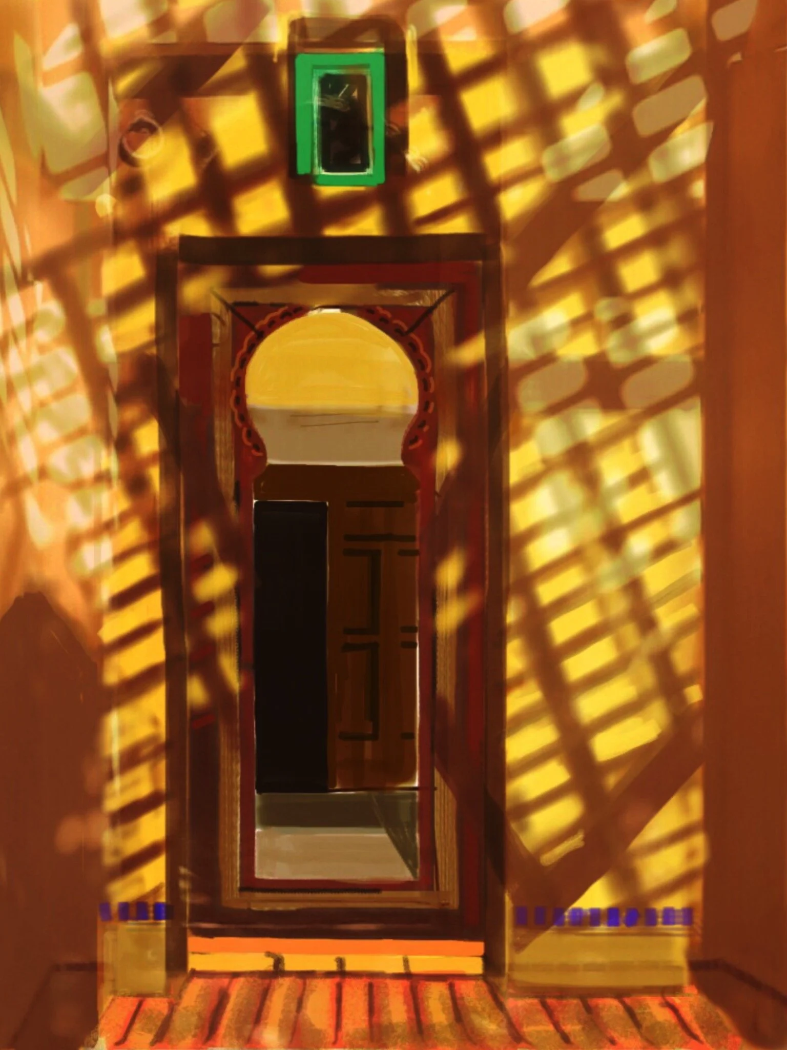
More than any other artist apps, ‘Brushes’ bet suits my way of working. The tools suit me because the colour wheel is unlimited, the layers can be built up, i.e. drawing first, colour second and detail third. It’s a matter of trial and error to master the endless possibilities. Love it!
Henri de Toulouse-Lautrec and M.C. Escher, two of your favorite artists, explored very different themes and styles. How do their influences manifest in your work, particularly in your approaches to drawing and perceiving space?
Toulouse-Lautrec has such a fluid and energetic line when drawing. Many artists at that time admired his graphic vision, the vibrant nervousness of his raw touch, the boldness of his ‘Japonizing’ compositions in a way he was a brilliant designer, who could balance space perfectly. I think his posters made ‘advertising’ an art form.
M C Escher makes very precise drawings, which can be very boring, into a picture puzzle that becomes magical. Very often they have a peripatetic quality, that transforms shapes into something else. I love this element of surprise. Reminds me of cloud shapes flowing from one image to another.
Drawing from your background in advertising as a designer/visualizer, how do you integrate the principles of visual communication and advertising into your art? Does this background influence how you design your compositions, considering viewer engagement and the communicative potential of your artwork?
When I went into advertising as a designer, I had already completed four years study at art college. The last two years were devoted to drawing and illustration. I took these skills into advertising, and for five years worked incorporating design and typography in a given space. I like to think that this experience has crept into my iPad pictures.
You have cited several artists known for their distinct handling of color and atmosphere, like Gustav Klimt and Camille Pissarro. Can you discuss how their influences shape your approach to color dynamics and atmosphere in your digital landscapes?
There are 2 pictures by Gustav Klimt that really impresses me. ’The Kiss’ with its wonderful flowing lines punctuated with gorgeous patterns of circles and flowers, is given purpose by the extraordinary passion expressed in the couples faces and hands. ‘Farmhouse with Birch Tree Trunks’, the eye travels up the tree trunks, through the grass and flowers reaching a horizontal line of heavy purple trees and bushes, at the very top of the picture. Vertical meets horizontal. Life meets death?
Pissarro - ‘Entrance to the Village of Voisins’. Shades and colour express the atmosphere of spring. Still a hint of winter in the air, harsh sun producing harsh long shadows. I can feel how it is.
Reflecting on your favorite designers like Andy Warhol and Roy Lichtenstein, who were pioneers in blending commercial art with fine art, how do you navigate the boundaries between these realms in your own work, especially considering the commercial nature of limited-edition prints?
With Lichtenstein and Warhol, I marvel at their sense of simple design and unbridled directness. ‘Wham’ and ‘Campbell soup can’ convey an honest, up front image, that the viewer cannot avoid. Like a good advertisement, they catch the eye, so you have to make a decision.
As technology evolves, so do the tools and methods for art creation. Looking ahead, what advancements in digital art tools excite you the most, and how might they influence your future work? Do you foresee incorporating any new technologies or techniques in your process to further push the boundaries of what can be achieved with digital painting "en plein air"?
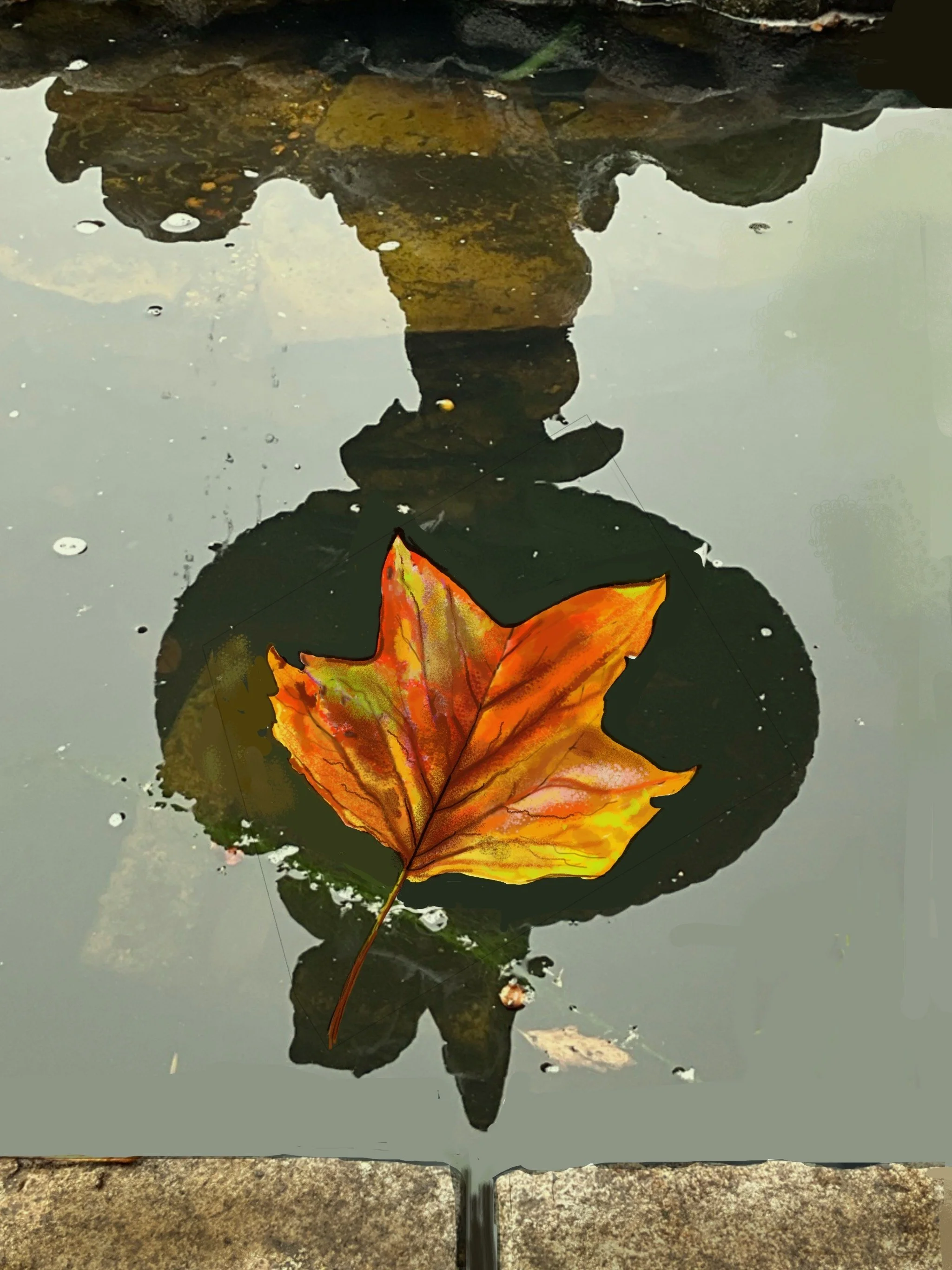
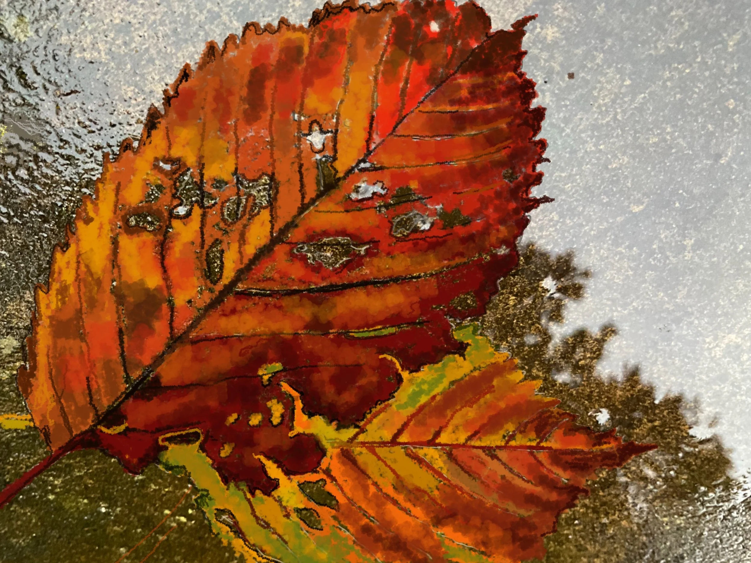
I find with the Brushes App, there are so many tools to play around with. For example, ‘Layers’ provides an enormous opportunity to experiment with colour, design, print and photography. You can add & abstract at whim, never really knowing what the final result might be. Often a lovely surprise, or a complete disaster you learn from both. Helps me to push forward on the journey of discovery.
